Community fans have been up in arms about NBC's recent decision to put the cult-inspiring sitcom on the shelf. The fear has come out in many forms (tweets, blog posts and soothing insider reports from New York magazine and others) that the show won't return, or will return in a truncated, rag-doll version of itself in the desolate summer months. The fear isn't totally unfounded, since Community pulls in fewer viewers each week than the almost universally reviled Whitney, but NBC has remained with underperforming shows in the past.
We all have our favourite under-the-radar choices. My boyfriend got me into Community, and he rolls his eyes every time I get overly excited about it, because, as he points out, he was into it first. I retort with Fever Ray. He comes back with E.T. (my childhood had some pretty serious pop-culture gaps in it), I point out the Crumpler bag he bought after I dragged him into their store, and then we just devolve into our reptile selves and slither around for a while, dragging our pop culture discoveries hideously behind us. We all do this. I crowed for months about King Of Kong, the amazing documentary about the world of arcade video record setting: "I showed you that!" I would cackle every thing it was mentioned. It's not pretty.
Mister Boyfriend was the one who first exposed me to Community, through their second-season zombie Halloween episode. I showed up half-way through and was completely flummoxed. Watching Community requires a basic understanding of who's who: the group dynamics aren't complicated, but you need to know that Jeff Winger is a bit of a juicebox, for instance, or that there's love quandrangle stuff between Britta, Annie, Jeff and Troy, and then the jokes will start flowing. Watching a few episodes of the first season is basically all anyone really needs to understand what's going on at Greendale, but it's not like Friends: viewers who benefit most from the sitcom's delights are the ones who pay attention and watch each episode multiple times. Casual viewers are likely not to enjoy it quite as much. For a drama like 24 or Lost, networks are comfortable allowing storylines to develop week-to-week and leave late-arriving viewers out of their loop, but sitcoms are expected to be accessible to even the most unaware viewer.
The show, in the last season, has started departing from its original premise of "mismatched friend group" and started looking more at the mechanics of storytelling. It started with the genre episodes, which collected cliches from action movies, zombie flicks and spaghetti westerns and spun them out into great, glorious 22-minute mindfucks that exist, somehow simultaneously, as spoof, homage, commentary and A+ example. Characters who were still wholly themselves found themselves transposed onto other types: sweet, high-strung Annie, for example, can exist as herself, but also become a leather-shorted paintball outlaw with a heart of gold in the western episode and, a few episodes later, be a cracked-out production assistant on a commercial shoot gone horribly wrong.
I want to talk for a second about the last episode NBC aired before yanking Community from its slot. Last week focused on Dean Pelton's attempt to update his college's recruitment commercial - what starts as a simple one-day shoot turns into Heart Of Darkness. Like, literally. Abed, who barely appears onscreen in this episode, films the school's descent into madness, which involves unzipped hoodies with no undershirt, a possum, a Chinese man wearing a blond wig under a baldcap, forced hugging, mo-cap suits, and Luis Guzman. The Dean's attempt to elevate a school he barely believes in to perfection drives him insane, and Abed's camera is there to capture it.
Last week's episode was one of the most interesting things I've ever seen on TV. The Dean's character, who is usually a punchline, was awarded a gravitas that didn't feel forced - he's a lunatic, sure, but usually he's a benignity. Give the man some power (something, interestingly, he doesn't get in his role of head of the school) and his drive to make the most of it creates some very weird moments. It was so over the top, but...thinking about the Dean over the last two seasons...it's possible to see the seeds from which this madness would sprout. His perfect costumes? His excitable nature? His upbeat yet despairing attitude towards what his school can do for its students? Those are all there since day one. The Dean's craziness in this episode is what happens when you take the Dean to extremes. Not any other character. Annie's craziness looks different. So does Troy's. The writers are good to their characters, and the actors respond with performances that had me literally on the edge of my seat. I kept turning to Mister Boyfriend with my mouth agape, like, can you even believe they'd put this on TV?
I don't know what the future holds for Community. Part of me wants the show to end next season - four years of school, four years of amazing, game-changing show. Donald Glover's rap career will take off, Dan Harmon can move to Shocase to start producing whatever new craziness his brain is going to dream up, and the show can live forever on DVD. Part of me wants what Troy and Abed treat as a mantra for Cougartown - "six seasons and a movie!" Most of me just hopes that the show comes back from its hiatus refreshed and invigorated. Abed's cocked eyebrow closes the last episode; we'll be waiting, Abed, spreading the word, forcing our friends and families to watch this weird, wonderful gem. I won't even say, "I watched this first."
Saturday, November 19, 2011
Wednesday, November 16, 2011
Font-ain Of You
Good design aways freezes me cold. Nothing showy: I'm talking about the ubiquitous, IKEA-brand design that everyone has, the stuff that just sort of quietly exists in the world without call attention to itself. I loathe lucite chairs and mirrored dining room tables, just as I've grown weary of the kitschy, Mary Englebreit-looking design. Things that scream "Look at me!" give me the willies - it's the same reason I rolled my eyes at Agyness Dean and generally find the Kardashians to be a total mystery, fame-wise.
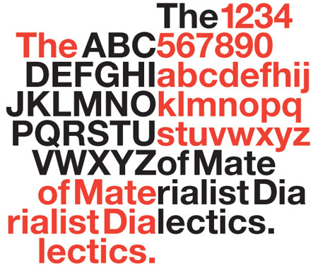
I just watched Helvetica, Gary Hustwit's debut documentary about the iconic font that's used everywhere from the New York City subway system to American Apparel signage. The doc discusses the font's visual impact - it looks so clean and modern, it inspired a whole slew of corporations in the mid-1950s and 1960s to move away from the swirly, comic-sans, exclamatory advertising style they had been working with and re-brand themselves as sleek, transparent, modern companies, in large part because the font could convey that they were sleek and modern. It sparked a movement towards clear, clean design that some designers would decry as soulless and oppressive - but we see Helvetica on the daily, because that sense of crisp professional trust is still embedded in its lines.
Font love is the natural resting place of the object fetishization that has dominated design for decades. It's hard not to get drawn in when designers talk about their favourite fonts - comic sans and papyrus seem universally reviled, but to the untrained eye, there's nothing inherently offensive in them. They might be less gorgeous than some of the more widely-used fonts, but folks also seem to love using them. Design snobs make me lose my mind, because they judge people who legitimately don't have a preference between Arial and Helvetica to be rubes, when the reality is that most untrained people a) can't tell the difference and b) don't care at all.
The design saying "form follows function" took me a long time to wrap my head around - like, form does the what now? But I finally started to get it when I read the New York Times Magazine article a few years ago called "The Road to Clarity," an insider's look at the ins and outs of designing highways signs. The author was swept up in the minutiae of the font choices, because in that case, it can be a matter of life and death: how heavy the letters are, how far apart they sit on the sign, how readable the final product really is, can all impinge on how quickly drivers can comprehend the information contained therein, and, obviously, make choices about what to do next. The function of the sign - conveying information - dictates the form of the font - being as legible as possible.
Bu why, then, isn't there just one or two fonts? After all, the information's going to come at us anyway, so why not just standardize the whole world? Make it all crisp and clear! Helvetica forever!
Looking around my room, I can see lots of fonts: the label on the Campari on the windowsill, for instance, features elegant serifs rimmed in gold and set against a navy background. The effect is one of casual, retro opulence - nothing too fancy, but especially when set against the bright ruby colour of the liqueur itself, it reads in my mind's eye as vibrantly upscale. The Coke Zero bottle beside me features a wealth of fonts and symbols: the classic swoopy font is set in red against the black background, and the bottle itself is a voluptuous curve; together, the elements work to create an image that's both trustworthy - that classic logo! - and modern. The choices that are made in product design may not save lives the same way highway signs might, but they all matter to someone. Just look at Coca-Cola's bottom line: you know those guys aren't messing with that look without some serious head-scratching.
I take a little bit of umbrage at the over-the-top opinions expressed by the designers interviewed in Helvetica - not because it's not important, but because they're such dicks about it. In the past, we were much less savvy consumers, because the products were much less intelligent in their marketing. We look at vintage buzzwords and laugh at how naked and needy they seem, and it strikes us as preposterous that anyone would fall for those snake-oil jobs. Now, though, we need to work through several layers of meaning in a design moment: images, products, packaging, and signage have all thoroughly and insidiously infiltrated our world.
There's a great shot in the movie of poster proofs hanging on a lightbox behind a designer's talking-head interview: it's the same image (crowded skateboarding park, big dusky sky, oversaturated purples, navies and electric yellows), and the time/date/place information done over and over, each proof using a different font. And each poster feels slightly different: the fatter, statelier fonts giving an ironic gravitas to the event, the electro fonts making it feel energetic, and so on. It wordlessly illustrates how important design can be, and how good design creates something you may not even be aware is orchestrated: it just leaves you feeling like you've learned something new.
Subscribe to:
Posts (Atom)
